

That crisp interface you shipped last week is going to date. That is my humble prediction and my provocation.
That generous white space, the single decisive CTA button, the animation curve so smooth you barely notice it, the sans-serif you didn’t notice because it’s like every other. This is all going to look like 2026 the way drop shadows look so 2008, and for the same reason: It was something made easy that everyone could make. We created an easy template to follow.
Everything that dates gets cheap first
Have a look at what has dated in our field.
Skeuomorphism dated the moment the texture packs shipped. Gradients dated when the tool put a gradient on every button by default. Flat design dated when every template was flat. The soft Material shadow dated when it became a setting. None of these were bad ideas, I love some of them still.
What makes them cheap, is when they become a default. A drop shadow that someone decided on is a decision. A drop shadow that was generated or came with the template is a default.
Shipping software has never been this cheap. A weekend and a decent prompt gets you something that would have taken a team a quarter five years ago. The constraints that used to force a product into a certain shape (the engineering cost, the review cycle, the dread of another redesign…) are ceasing to exist.
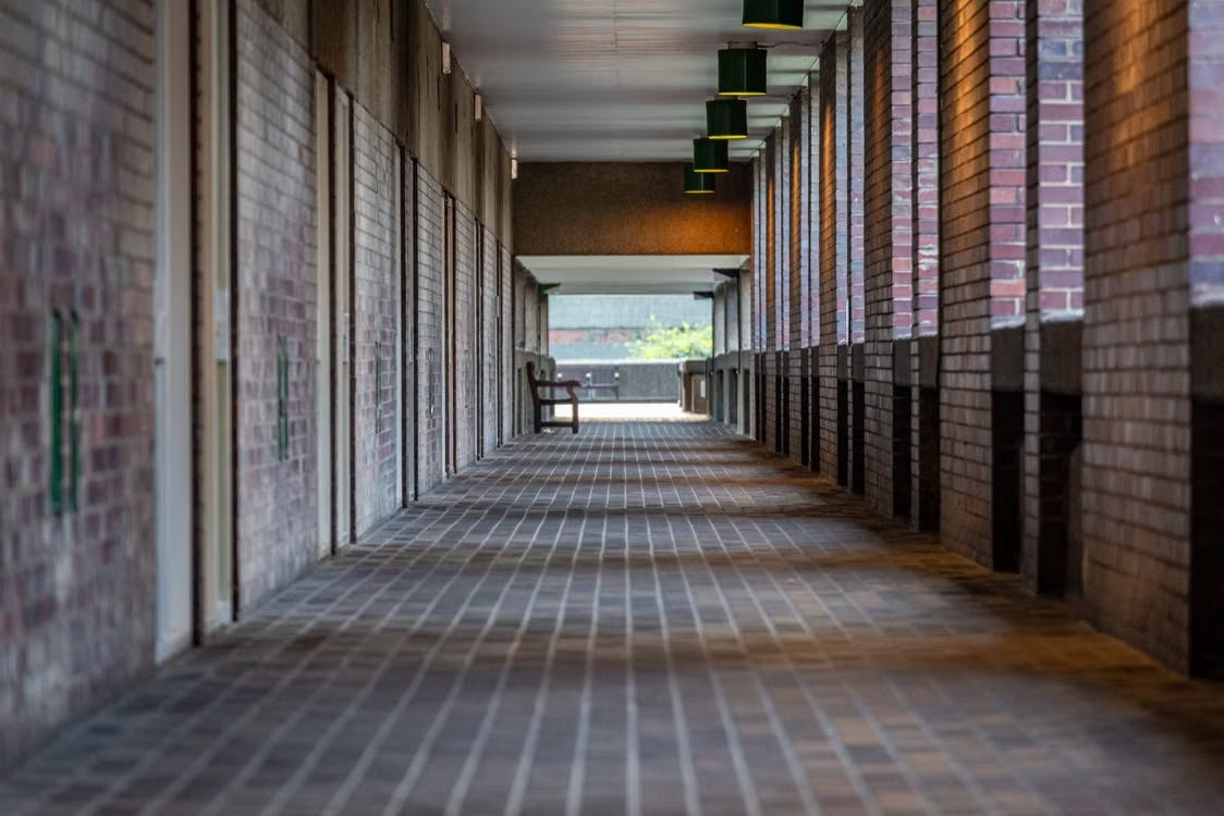
When constraints like that lift, you’d expect our creativity to explode. I mean cheap printing gave us zines, cheap synthesisers gave us a decade of bedroom music that sounded like nothing we’d heard before. Cheap concrete gave us the Barbican, which half of London hated for thirty years and now queues up to photograph.
Cheap software has given us ten thousand landing pages with the same hero, the same spacing, the same typeface, the same button. We have been handed the widest set of possibilities the discipline has ever had, and yet we are still using it to make flat average design we've ever made.
Why it got worse with AI
Ask a model for a landing page and you get the centre of the distribution, because that’s how they work right now. The models were trained on everything we already made. Nothing in their output is wrong actually. My pushback is that it isn't a decision either, however beautifully it renders.
What worries me is that we have started to accept the smooth, flat average without questioning it. The default is right there, it looks finished which is very hard to argue with when you’re busy. So we ship it. Once enough of this is in the world, the crisp interface stops being a thoughtful act of care and starts reading as the quickest, safest route to getting something out the door. I predict this will feel dated the way stock photography feels dated, the moment you see it, it feels impersonal.
I can hear the objection already. Conventions exist because they work for people, and consistency matters enormously for accessibility. This is true, and now that we can generate interfaces on the fly, we should be doing more for accessibility and inclusion, not less. There are no excuses now.
But the same malleability cuts the other way. If an interface can adapt to a screen reader, it can adapt to a mood. We can bring bold type, real texture and a bit of provocation to people who were only ever offered the bland version. The best design surprises you, and surprise is designed.
Who’s already doing it
The good news is that some people are already setting about making the most of all our new toys, and they are easy to spot because nothing else looks like them. What they share is not a style. In each case someone had a default available and chose something else.
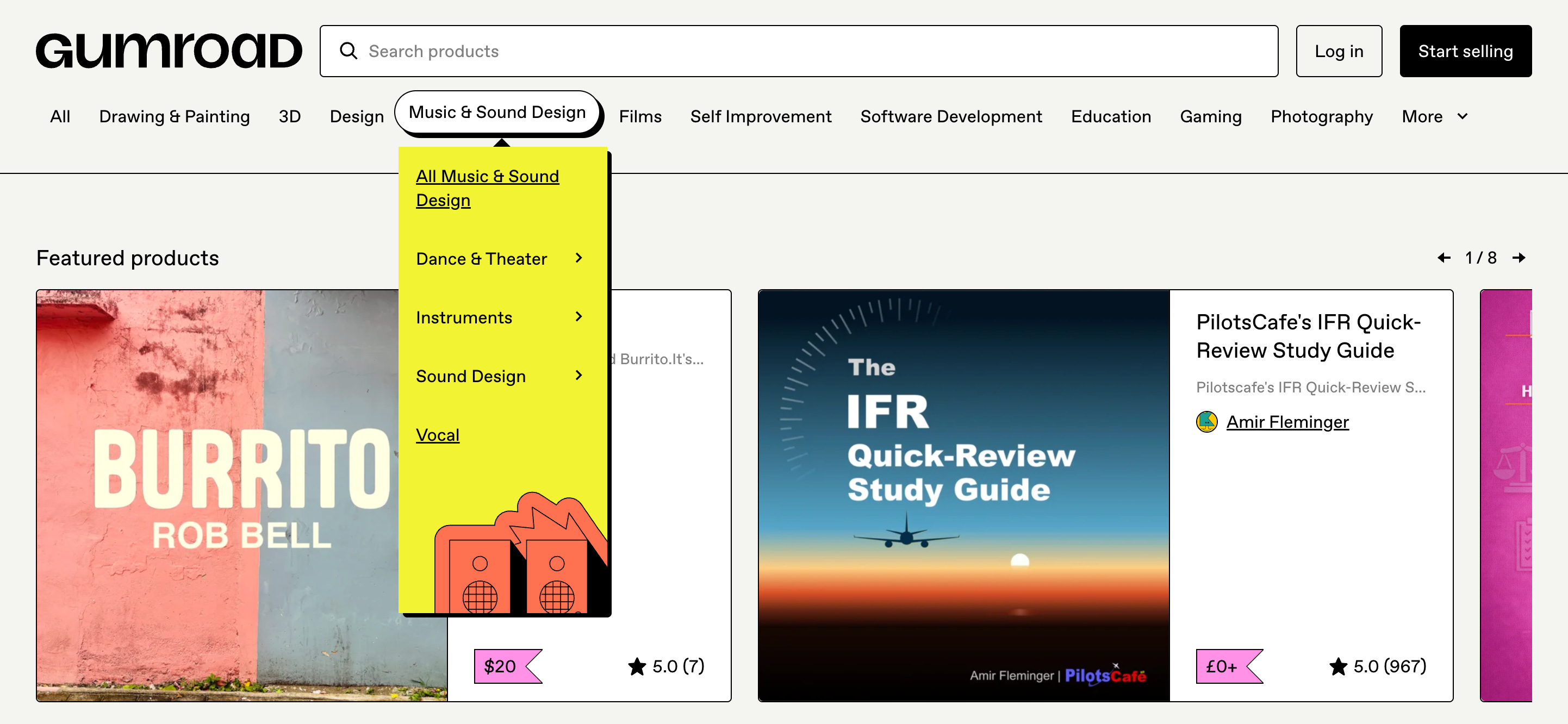
Gumroad is popular for good reason. A payments tool, of all things, with flat colour, heavy black borders and type that’s far too big, and it turned a checkout into something creators recognise from across the room.
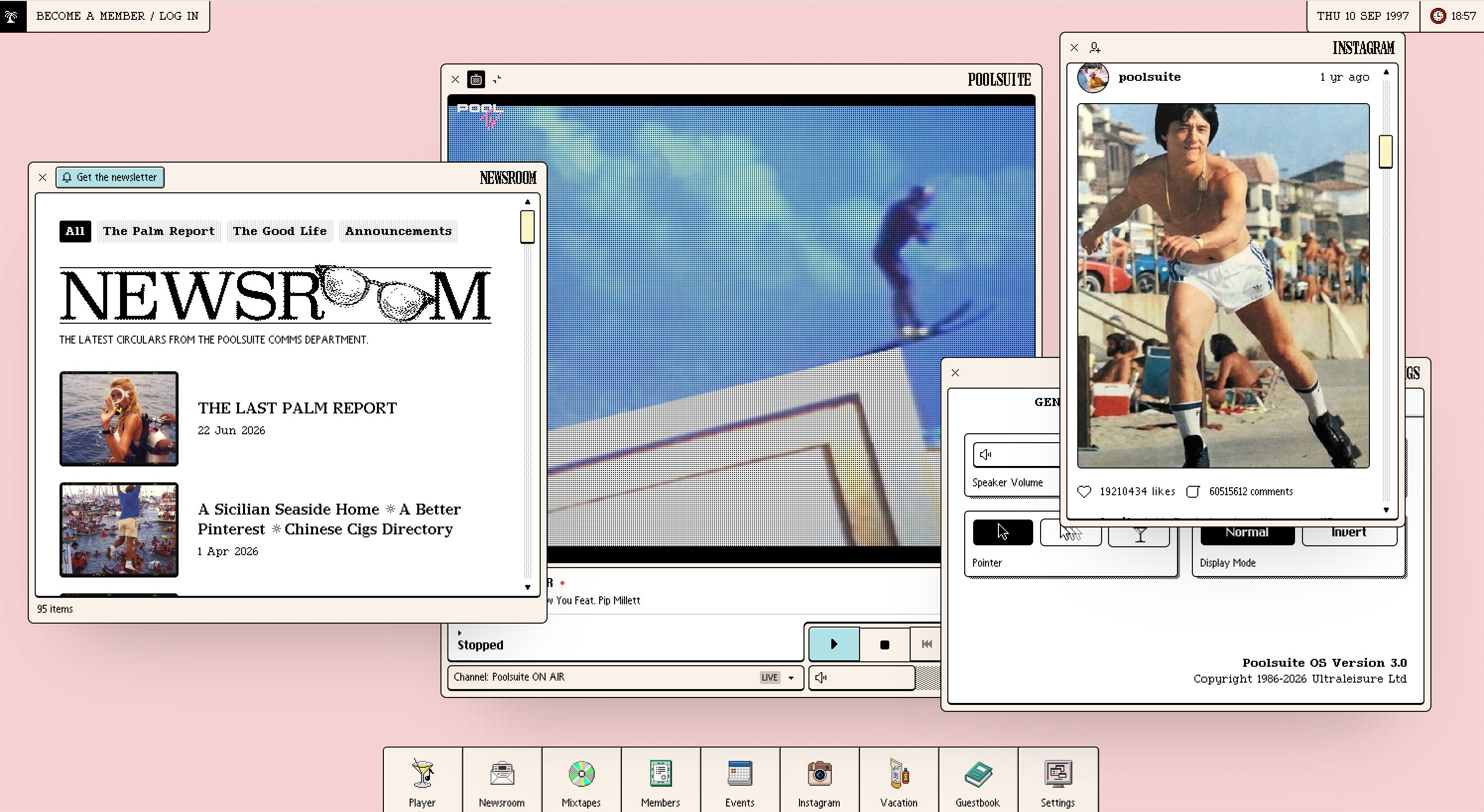
Poolsuite FM is a working music player dressed as a 1999 desktop, every window and button slightly wrong in a way that took real craft to get right. It’s proof that friction, chosen carefully, reads as pleasure.
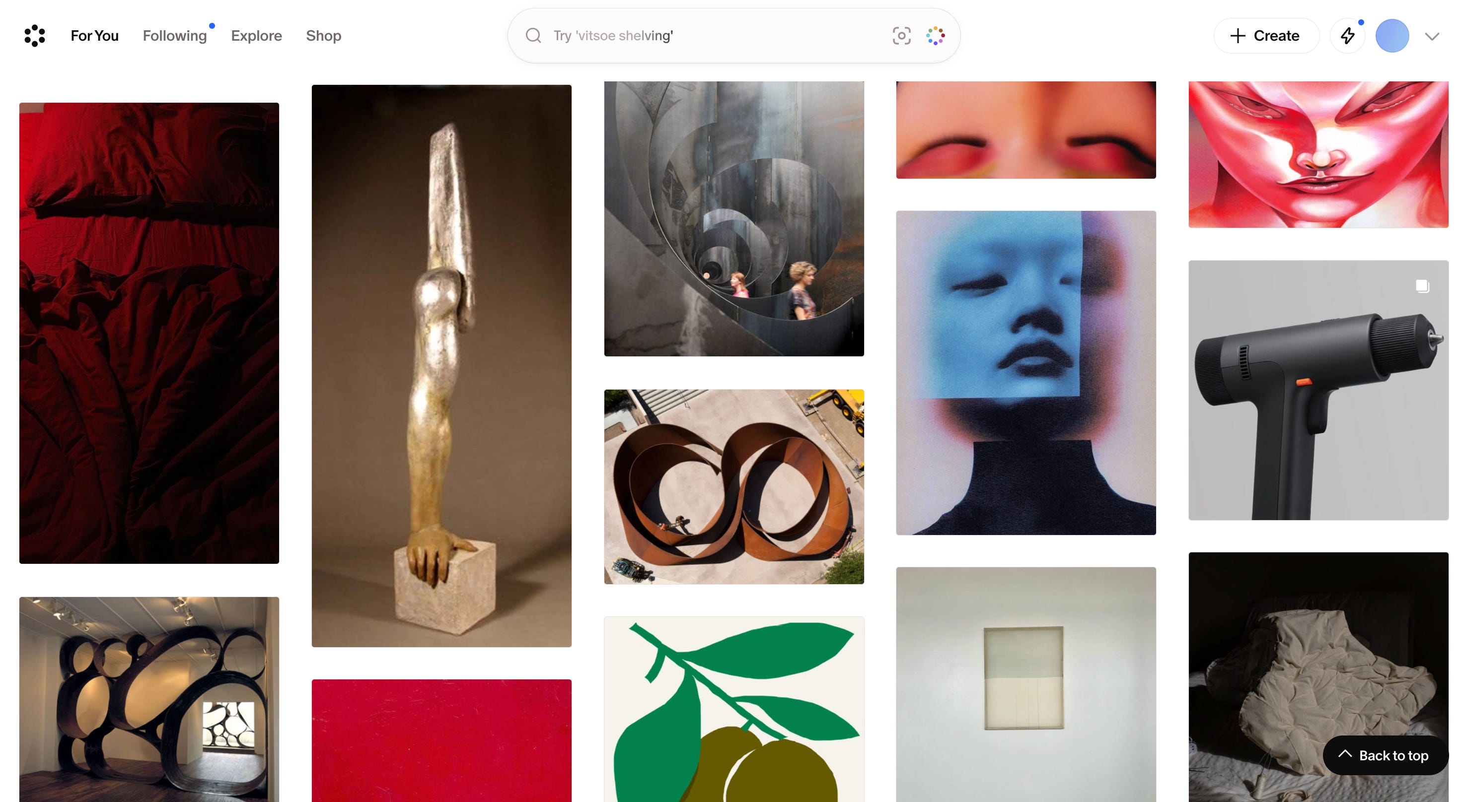
Cosmos is where a lot of designers went when Pinterest became a feed, and its chrome is dense and unpolished on purpose.
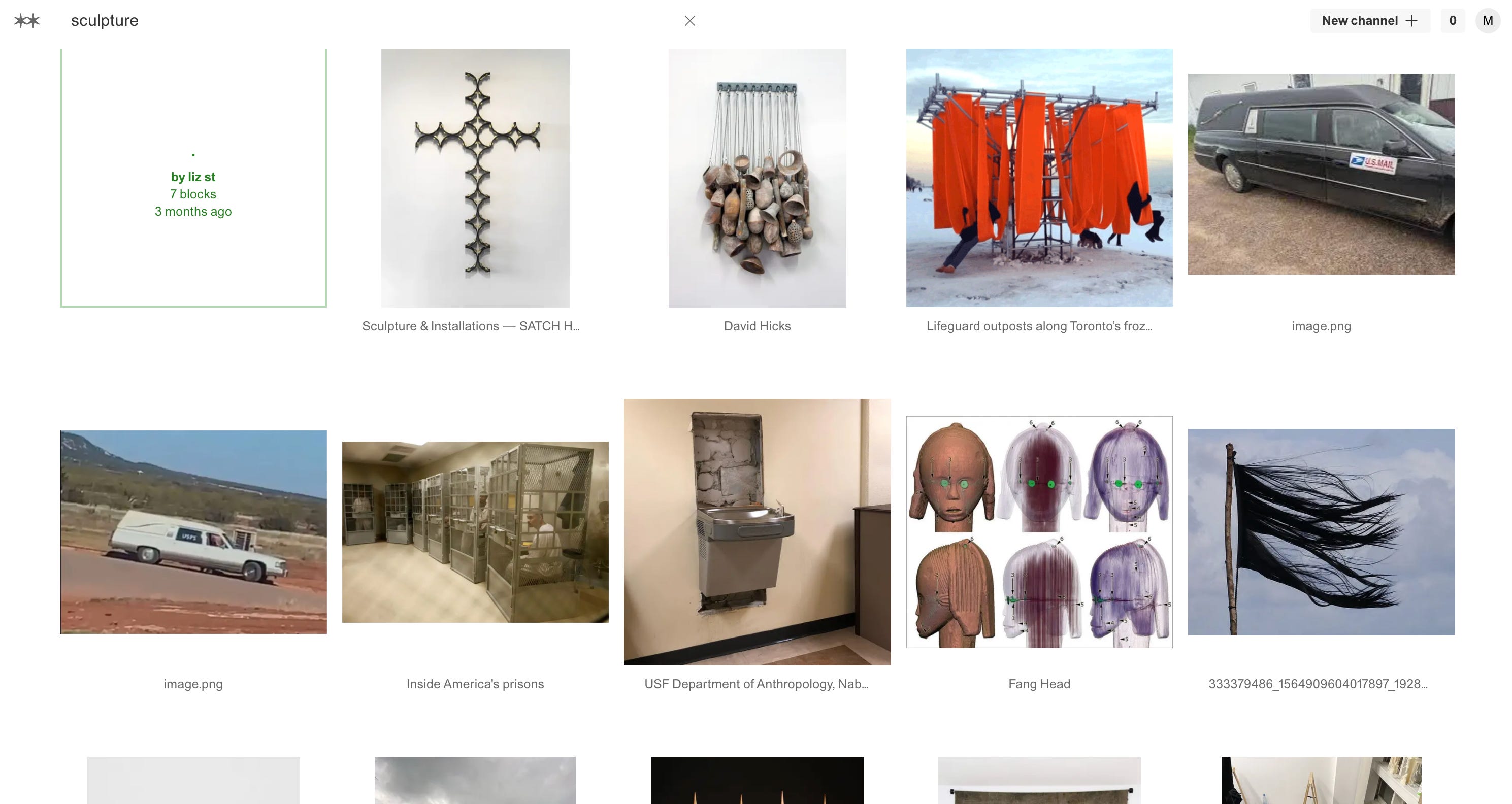
Are.na has refused to be a feed for over a decade. No algorithmic next, no infinite scroll, you move between blocks at the pace of someone in a library.
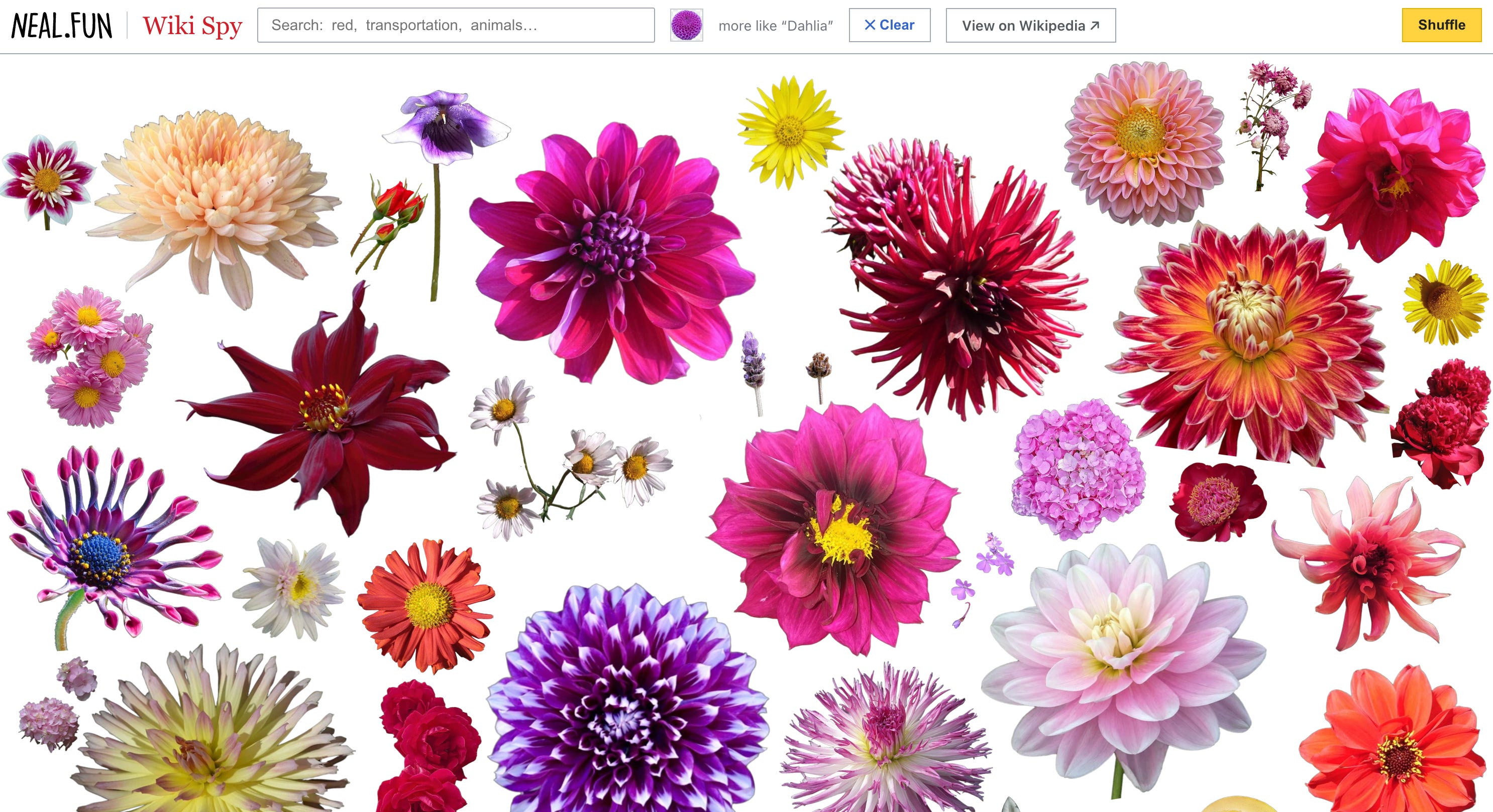
I’ve also loved neal.fun’s wikispy and found it super interesting how popular it became. It’s sort of impractical and beautiful at the same time. A thought provoking articulation of something different.
Substack belongs on this list too. The reading surface is deliberately slower than a feed. Generous line height, considered margins, no autoscroll, no recommendation widget tugging at your sleeve halfway through a paragraph. That’s friction, and it’s why writing here feels like writing rather than just content.
Then there’s Nothing, the London hardware maker, which is the most interesting case because it just moved in the other direction. Nothing built its whole identity on a dot-matrix typeface and a monochrome, slightly retro interface, the kind of grit almost no hardware company would risk.
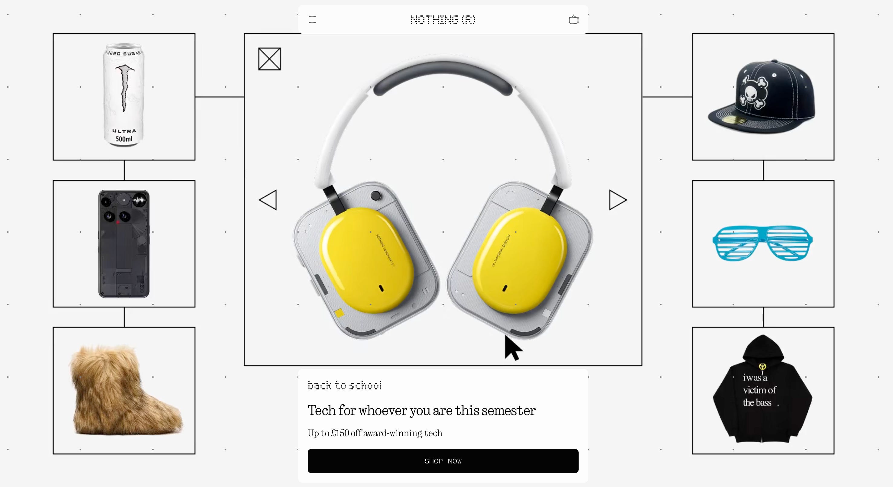
In every case you are no less able to do what you came to do. There’s pleasure in these products because they’re thoughtful and different.
This has happened before
When machines made furniture and fabric cheap in the nineteenth century, William Morris and the Arts and Crafts movement didn’t try to out-manufacture the factory.
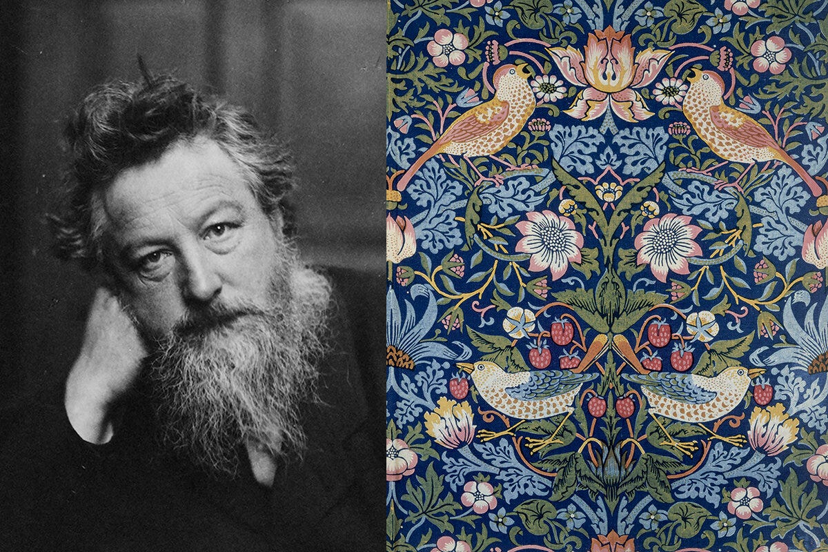
They made the handwork visible on purpose. The point was never that machine goods were bad but that once anything could be made, how we choose to make them matters more. Morris liked to break patterns, show the mark of the tools, the hand made qualities of the work.
I think that’s where we are. The production side of design has largely been solved for us, and I don’t think we should mourn it for too long. What it leaves for us is the part of the job that was always the most interesting bit, and that we rarely got the budget for: deciding what something should feel like, and having the nerve and now the means, to make it feel that way.
So this is our chance, in my opinion. Ship the interface with the type that’s slightly too big or strong or a bit weird. Keep the transition that lingers a beat longer than the guidelines say. Refuse the autoplay, refuse the carousel, refuse the fourth shade of grey or taupe. Let something in the product be visibly made by a person who could have smoothed it out and didn’t. Show the fingerprints.
Finally, we get to bring the artistry we always wanted into our products, because the material of software is becoming more and more malleable, cheaper and easier to work with. Lets enjoy it and make the most of it. It does require us to be a little contrarian to get there, but done well I think it’s worth it.
Thank you to the people keeping the edges on things. I had a lot of fun reading and browsing through Maria Izvestkina’s substack which is full of great inspiration and sent me down rabbit holes.
This is the part that really caught me:
“deciding what something should feel like”
It made me think about the layer before the interface.
Because by the time we're deciding what something should feel like, a huge number of decisions have already happened: what the business wants, what the product team means, what engineering interprets, what the customer actually needs.
The interface is where those things meet.
I'm increasingly interested in what happens before that point.
This piece is a great exploration of what AI and dramatically cheaper software production might mean for interface craft.
“we have started to accept the smooth, flat average without questioning it”
Possibly true before the rise of LLMs, but perhaps there is something that adds an extra spark of creativity now that they can reproduce this too.
Love all the examples and would be very into arts and crafts marque 2.